15 Video Styles for Marketing, Compared: Screen Recording, 3D, Cartoon, Isometric, Whiteboard, Kinetic Type and More, With Our Own Examples
Video styles for marketing compared: screen recording, mock interface, live action, motion graphics, kinetic typography, infographic, diagram, isometric, 3D, cartoon, paper cutout, whiteboard, terminal, retro and AI-generated footage. What each one can show, how hard it is to change after a release, where it misleads a buyer, and a frame from one of our own shorts in twelve of them.
Part of our guide to The 12 Types of Marketing Videos Software Companies Actually Need, and the 4 That Waste the Budget.
Video styles for marketing are the visual languages a marketing video can be made in: a screen recording, a presenter on camera, motion graphics, 2D cartoon, 3D, isometric, paper cutout, whiteboard, kinetic typography and the rest. The style is a separate decision from the type of video. An explainer video can be a cartoon or a screen recording; a product demo can be a mock interface or the real one. This page compares fifteen styles on what each one can show, what it is good at, how hard it is to change after a release, and where it misleads a buyer.
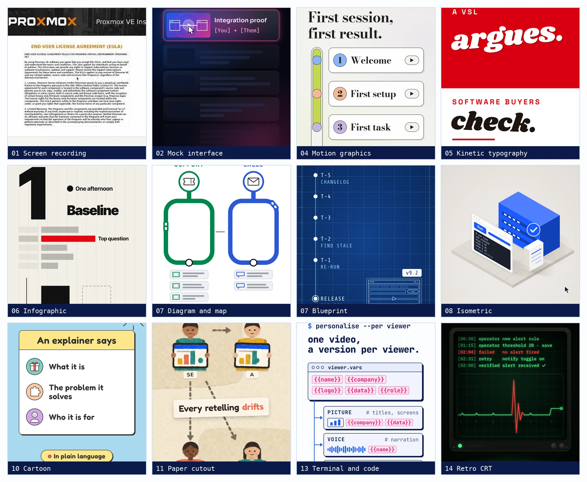
We made the examples ourselves. In the last week we built twenty-three thirty-second shorts for this site, each in a different style, all generated from code and a storyboard, so the collage below is our own work rather than a borrowed showreel. Where we have not made a style, we say so.
Video styles for marketing at a glance
| Style | What is on screen | Best for | To change after a release | Where it misleads |
|---|---|---|---|---|
| Screen recording | The real product | Demos, tutorials, proof | Record the task again | Only if the version is hidden |
| Mock interface animation | A drawing of the product | Launch films, feature teasers | Redraw the screens | Looks like the product, is not |
| Live action | People, places, hardware | Trust from a face, physical products | Reshoot | A presenter can claim anything |
| Motion graphics | Shapes, type, icons | Concepts, brand pieces | Edit the project file | Rarely; it is openly abstract |
| Kinetic typography | Words in motion | Arguments, sales letters, quotes | Retype | Rarely |
| Infographic and data | Charts, numbers, steps | Results, comparisons, processes | Update the figures | When the numbers have no source |
| Diagram, map and blueprint | Boxes, lines, schematics | Architecture, flows, timelines | Move the boxes | Rarely |
| Isometric | 2.5D scenes of blocks and screens | Platforms, infrastructure, systems | Rebuild the scene | Suggests a product that may not exist |
| 3D animation | Rendered objects and spaces | Hardware, physical products, spectacle | Re-render | A render can show a device that does not ship |
| Cartoon and character | Drawn people and scenes | Stories, onboarding, friendly brands | Redraw and re-animate | Rarely; nobody mistakes it for proof |
| Paper cutout and stop motion | Cut shapes moved frame by frame | Warmth, craft, small brands | Reshoot or rebuild | Rarely |
| Whiteboard and hand-drawn | A hand drawing as it speaks | Education, step-by-step ideas | Redraw | Rarely, but it dates fast |
| Terminal and code | Commands, logs, output | Developer audiences, APIs, CLIs | Rerun the commands | When the output is typed, not run |
| Retro and analogue | CRT, VHS, film grain, print | Attention, nostalgia, contrast | Re-skin | Rarely |
| AI-generated footage | Synthetic video from a prompt | B-roll, moods, concepts | Regenerate | It has never seen your product |
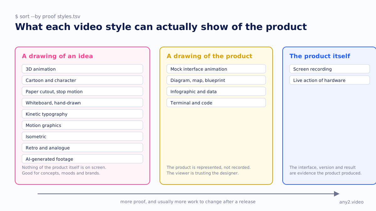
Two patterns run through the table. The further a style is from the real product, the cheaper it is to make pretty and the less it proves. And the styles that show the product itself are the only ones a release can make wrong, which is why a version tag belongs on them and not on a cartoon.
1. Screen recording
The product's own interface, captured while someone uses it. It is the plainest style on the list and the only one in which the thing being marketed is actually on screen. A good screencast shows a task from its starting state to a result the product itself produces, with the cursor visible and the version somewhere in frame.
Good for: demos, tutorials, onboarding, support deflection, integration proof, anything a buyer will later check for themselves. Weak for: brand mood, abstract positioning, products without a screen. Changing it after a release means recording the task again, which is the honest cost of the honest style. Our Proxmox VE 9.2 install is this style with nothing added except captions and a log.
2. Mock interface animation
A redrawn version of the product's screens, animated in a motion tool: panels slide in, a cursor glides, numbers count up. It is the default style of SaaS launch films because it looks like the product and behaves better than the product. Our neon search short and our clean product demo short are both mock interfaces, drawn in two different moods.
Good for: launch films, feature teasers, homepage heroes, anything where the real interface is not ready or not pretty. The problem is that it is a drawing of a claim. Nothing in it ran, so nothing in it can fail, and a buyer who later opens the product may find the drawing was aspirational. Use it for the promise and pair it with a recording for the proof. The interactive demo tools are a clickable cousin of this style with the same limitation.
3. Live action
People on camera: a founder, a customer, an engineer at a bench. It is the style for trust that has to come from a person rather than from an interface, and the only style that can show hardware being handled. We have not made a live-action piece for this site; our comparison of live action vs animation covers when it is worth the cost.
Good for: testimonials, founder stories, physical products, events. Weak for: anything that changes often, because a reshoot needs the same people in the same room. A presenter can also say anything, so a live-action demo still needs the screen cut in where the claim is made.
4. Motion graphics
Abstract shapes, icons, type and colour in motion, with no attempt to depict the product literally. Our onboarding short, with its pastel pills and soft shapes, is motion graphics; so is most of what a brand agency means by "an animated explainer".
Good for: concepts, positioning, the "why" before the "how", brand pieces that must stay valid for years. It is openly abstract, so it rarely misleads, and it is quick to edit because everything is a layer in a project file. Its weakness is that it cannot show anything. A motion-graphics explainer for software has to hand over to another style the moment the viewer asks what the product looks like.
5. Kinetic typography
Words as the picture: a headline that slams in, a sentence that builds one word at a time, a quote that fills the frame. Our video sales letter short is pure kinetic type on a red and cream poster grid, and our short-form versus long-form piece is a cousin in the broadside tradition.
Good for: arguments, manifestos, sales letters, quotes from customers, any message that is really a sentence. It works with the sound off, which matters for feeds. Weak for: showing anything. It is the cheapest style to update, since changing the video means changing the words, and it is hard to make it feel like anything other than a brand with a point to make, which is sometimes exactly right. To try it on your own brand, our free AI video maker makes a kinetic type video in the browser.
6. Infographic and data
Charts, counters, steps and numbers laid out on a strict grid. Our "test it in an afternoon" short is this style in its Swiss form: huge numerals, one signal red, bars with no values. That last detail is deliberate. The page it points at refuses to invent a statistic, so the bars show a shape, not a figure.
Good for: results, comparisons, processes, pricing structures, anything with a sequence or a quantity. Easy to update as long as the data has a source. It misleads only when the numbers do not. A chart with a confident axis and no citation is a very common marketing video, and a buyer who asks where the number came from is right to.
7. Diagram, map and blueprint
Boxes, lines and labels: an architecture drawing, a flow, a timeline, a transit map. Our subway-map short draws a support line and a sales line converging on one video; our blueprint short lays a release week out as a rail with a stale demo re-run at T-1. Both are diagrams that move.
Good for: how a system fits together, where a product sits in a stack, what happens in what order. Developers and architects read this style natively. It is quick to change, because a changed architecture is a moved box, and it rarely misleads, because nobody mistakes a box for a server. Its limit is emotional range: a diagram can explain, but it cannot delight, and it should not try.
8. Isometric
Scenes built from blocks at a thirty-degree angle: little servers, floating screens, a cursor the size of a car. It is the house style of cloud and infrastructure marketing because it makes invisible things look like a place. Our "clickable tour or real recording" short is isometric, with a hollow pink outline where the tour's product should be and a solid blue machine where the recording's is.
Good for: platforms, pipelines, multi-part systems, anything with no single screen to show. Slower to change than a flat diagram because every object has three faces and a shadow. It misleads in a specific way: an isometric world is so tidy that it implies a product as finished as the drawing, which is a promise the drawing cannot keep.
9. 3D animation
Fully rendered objects, materials and camera moves. It is the most expensive style on the list to make and to change, and the only one that can show a physical product from every side before the product exists. We have not made a 3D piece for this site; for software it is almost always the wrong tool, since a rendered laptop with a rendered screen is a mock interface with extra steps.
Good for: hardware, devices, appliances, packaging, spectacle. Weak for: anything that changes, and anything where the buyer needs to see the real interface. The failure mode is the render that ships before the device does, showing a port or a finish the final unit does not have. Hardware vendors have the strongest case for it and the most to lose from it.
10. Cartoon and character animation
Drawn characters in drawn scenes, from flat sticker figures to full 2D animation. Our explainer-video short is the sticker end of this style: a cloud, a daisy, three rounded cards. It is the warmest style on the list and the one that most clearly says "this is a story, not a demo".
Good for: onboarding stories, the problem before the product, brands that want to be liked, audiences who are tired of interfaces. It never misleads about the product because it never shows one. It is slow to change, since a character has to be redrawn and re-animated, so it suits messages that stay true for a long time and should be kept away from anything a release can alter.
11. Paper cutout and stop motion
Shapes that look cut from card, layered with shadows and moved a little at a time, as if someone photographed each step. Our "partners give the same demo" short is a paper cutout: a sales engineer and three partners holding little paper screens that drift until a video tile tapes them all back to the same picture.
Good for: craft, warmth, smaller brands, anything that wants to feel made by hand. Real stop motion is slow and expensive to redo; the digital version, which ours is, is a redraw like any other animation. It rarely misleads. Its weakness is that it is a strong flavour, and a software company that uses it once has to decide whether it is now a paper company.
12. Whiteboard and hand-drawn
A hand draws the picture as the voice explains it, usually on white, usually fast. It had a long run as the explainer style of choice because it is cheap and the drawing-as-it-speaks trick holds attention. Our explainer video term page is blunt about it: cheap, and showing its age. We have not made one.
Good for: education, step-by-step reasoning, one-idea-at-a-time arguments. Quick to change in the digital form. Its weaknesses are that it looks like every other whiteboard video and that it can only ever draw a claim. A hand sketching a dashboard is still not a dashboard.
13. Terminal and code
A command prompt, typed commands, scrolling output, a log with timestamps. Our video personalisation short is in this style, with a mock terminal that reads a viewer's variables, and our CRT short puts a run log on an oscilloscope. For a developer audience it is not a style so much as the native language.
Good for: APIs, CLIs, infrastructure, anything the buyer will later type themselves. Trivial to update when the commands are real: run them again and record the output. It misleads in one way, and badly: when the output was typed into a text layer rather than produced by the command. A log that could not have failed is a drawing with a monospace font.
14. Retro and analogue
A CRT monitor with scanlines, a camcorder with a REC light, film noir shadows, a letterpress poster. Our "why showing a failure sells" short is green phosphor on black, our raw-footage short is a camcorder viewfinder, and our B-roll short is film noir. Each is a costume worn over a diagram.
Good for: attention in a feed, contrast with a clean brand, a message about time, memory or evidence. It is a skin, so it is easy to change and rarely misleads. The risk is tone: a retro frame around a serious infrastructure product can read as a joke, which is fine if the joke was intended.
15. AI-generated footage
Video synthesised from a text prompt or a still: a city at dusk, hands on a keyboard, an abstract data flow. It is the newest style on the list and the fastest to produce. Our review of AI video generators for product marketing covers the current tools and what each one can and cannot do.
Good for: B-roll, moods, concept shots, filler between real scenes. It is cheap to regenerate. Its limit is absolute: a generator has never seen your product, so any interface it draws is invented, and any claim it illustrates is unsupported. Use it the way a photographer uses stock, around the product and never as the product.
Which video style is best for software marketing?
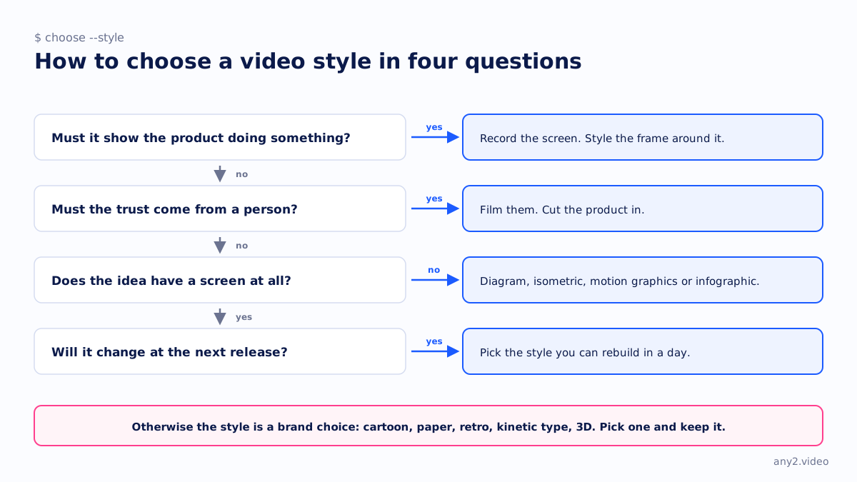
For the part of the video that makes a claim about the product, a screen recording, because it is the only style in which the product is on screen and the version can be read. For the part that explains the idea, diagrams and motion graphics, because they are quick to change and openly abstract. Most good software marketing videos are two styles: a styled frame around a recorded task.
What is the cheapest video style to update after a release?
Kinetic typography and diagrams, because a change is a retyped word or a moved box. Terminal and screen-recording styles are cheap to update when the task is scripted, since updating means running it again on the new version; our release campaign page shows the week that takes. Character animation, 3D and live action are the most expensive, because each needs the original people, models or scenes back.
Is animation or live action better for marketing videos?
Neither is better; they answer different questions. Animation, in any of the drawn styles above, is better when the subject has no screen or no face, and when the message must stay valid for years. Live action is better when trust has to come from a person or the product is physical. For software, the question is usually a false choice, because the style that proves anything is the third one: the recorded screen. The live action vs animation page goes through the cases.
Do B2B buyers care about video style?
They notice it, and they discount it. A technical buyer watching a mock interface knows it is a mock, and watching a cartoon knows it is a cartoon; the style sets expectations rather than winning the argument. What they look for is whether a task finishes, whether the version is stated and whether anything goes wrong on screen, which is the rubric in our annotated video marketing examples. Style decides whether they keep watching. Proof decides what they believe.
Mixing styles without confusing the viewer
Most of our own shorts mix two: a diagram or cartoon for the idea and a drawn interface or a run log for the product. The rule that keeps it coherent is that each style gets one job. The styled frame explains, the recorded screen proves, and the viewer always knows which one they are looking at. The failure is the reverse: a mock interface so good that it is taken for a recording. If a drawing could be mistaken for the product, label it, or replace it with the product.
The other rule is version. Anything that shows the product, in any style, should carry the version it shows, so that when the release moves a button, the video says which button it was drawn against. That is the difference between a style and a claim, and it is the whole argument of what a verified walkthrough proves.
Pick any style you like for the frame. Send us one task and we will record the part inside it on the real product, version on screen. The first sample is free.
$ get-sample →